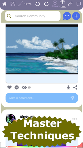
Improving landscape painting involves a understanding fundamental art principles and practicing these techniques. Here is what Paintology has to offer
I. Core Art Principles
Composition: This is the backbone of any successful painting.
Rule of Thirds: Divide your canvas into nine equal sections with two horizontal and two vertical lines. Place focal points or key elements along these lines or at their intersections for more dynamic and pleasing compositions.
Leading Lines: Use natural or implied lines (rivers, roads, fences, edges of fields) to draw the viewer's eye into and around the painting, creating a sense of depth and movement.
Focal Point: Identify a clear main subject or area of interest. All other elements should support and direct the viewer's eye to this point. Avoid placing your focal point directly in the center.
Horizon Placement: Avoid placing the horizon line exactly in the middle of your canvas. A higher horizon emphasizes the foreground and land, while a lower horizon emphasizes the sky.
Balance: Aim for a visually balanced composition. This doesn't mean perfect symmetry, but rather a harmonious distribution of elements. Asymmetrical balance can often be more interesting.
Simplification: Don't try to paint every single detail. Simplify the scene, focusing on the most impactful elements and allowing less important details to fade into the background.
Thumbnail Sketches/Value Studies: Before you start painting, create small, quick sketches to plan your composition, explore different arrangements, and work out your light and dark values. This can save you a lot of time and frustration later.
Color Theory:
Warm and Cool Colors: Use warm colors (reds, oranges, yellows) to bring elements forward and cool colors (blues, greens, purples) to push them back, creating depth.
Atmospheric Perspective: Colors tend to become lighter, cooler, and less saturated as they recede into the distance due to the atmosphere. Applying this principle adds realism and depth.
Color Harmony: Consider using a limited or analogous color palette (colors next to each other on the color wheel) for a cohesive look. Complementary colors (opposite on the color wheel) can create strong contrast and draw attention to a focal point.
Mixing Greens: Don't rely solely on pre-mixed greens. Experiment with mixing your own greens using blues and yellows, and adding small amounts of browns or reds to create more natural and varied tones.
Light and Shadow (Value):
Observe Natural Light: Study how light affects the landscape at different times of day. The "golden hour" (sunrise/sunset) often provides dramatic lighting with long shadows and warm hues.
Contrast: Strong contrasts between light and shadow add drama, depth, and help define forms.
Clear Light and Shade Patterns: Clearly define areas of light and shadow to give your painting a three-dimensional quality. Start by establishing your darkest darks and lightest lights early on.
Layering Shadows: Shadows aren't flat. Use a variety of tones within shadowed areas to create depth and dynamism.
Texture:
Varied Brushstrokes: Experiment with different brushstrokes to create a variety of textures. Short, choppy strokes for grass; long, fluid strokes for water; rough strokes for tree bark.
Palette Knife Techniques: Use a palette knife to apply thick, impasto layers of paint for highly textured effects, like rocky surfaces or dense foliage.
Dry Brush: Use a dry brush with minimal paint to create fine textures, such as the grain of wood or the roughness of a stone.
Foreground Detail: Generally, you'll want more texture and contrast in the foreground, with details fading as the scene recedes.
Perspective:
Linear Perspective: Understand vanishing points and horizon lines to accurately represent objects based on their relative size and position in space, creating a sense of depth.
Atmospheric Perspective: As mentioned above, changes in color, value, and clarity help create the illusion of distance.